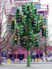
I’ve been thinking a lot about traffic lights recently.
Why are there three lights? Why are they vertically arranged? And how can the answers help us understand inclusive information design?
We learn from an early age that red means stop and green means go. We also learn the convention is to have red at the top and green at the bottom.
According to a Stanford University research article, “Roughly 1 in 10 men are fully or partly colour blind.” Although colour-blindness affects men and women, men are 20 times more likely to be colour blind than women.
For people with the most common types of colour-blindness, it’s hard to distinguish between red, yellow and green.
At a road junction, someone with red-green colour-blindness can see whether the red or green light is lit because of the additional information provided by the vertical arrangement of the lights.
In the world of project management, a common usage of the traffic light metaphor is as a project reporting device, using red, amber and green (RAG) to denote the current status of a particular aspect of the project. Red usually means there’s a problem, while green is all systems go.
In project reporting it’s common to show a single spot of colour to denote a RAG status (See 1a below).
To someone with colour-blindness the information design has failed. Showing a single traffic light removes the contextual information required to determine whether it’s red or green (See 1b below). That’s quite a fundamental problem.

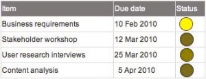
Once the colours become indistinguishable, it’s no longer possible to use the Gestalt principle of similarity to help us distinguish between the symbols.
One option is to reintroduce the full traffic light, with the RAG-status colour lit. Having three lights arranged vertically means that you don’t have to distinguish between red and green to know what the current status is. You just have to remember that top means stop. This option (not illustrated) would require some reworking of the grid to accommodate readable traffic lights, and would not make efficient use of the space available.
So what other options are there?
Adding the initial letter of the RAG status to the symbol enables us to see the differences (2a).
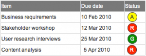
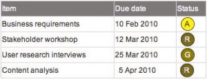
However, the colour-blindness simulation (2b) shows it still requires some cognitive effort to read the letters.
Better still, use a different shape for each of the three RAG statuses, as well as the colour (3a and 3b).
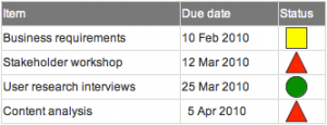
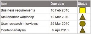
It’s easier to scan for triangles than the letter “R”, for example, to quickly identify the Red items.
Whichever you choose, it’s important to include a key in the diagram as well.
There’s a massive drive on at the moment to make public data available, and to use graphic design techniques to make sense of it all. A popular example is to overlay crime statistics on to a map. As data visualisation becomes ever more possible and ever more popular across digital and print media, the principle of inclusive design has never been more essential.
In a nutshell: to ensure your information design is inclusive, don’t rely on colour alone to convey meaning.
Tools and references:
- Vischeck – colour-blindness simulation tools for testing images and web-pages.[N.B. the simulations shown above were generated using Vishceck’s online simulator, using the Protanope colour vision setting, a form of red-green colour-blindness.]
- Colour-blindness (Wikipedia article)
- Traffic lights (Wikipedia article)
thanks for this very clear and inciteful article. Use of traffic lights as metaphor seems to be increasing in health care but use of colour detection testing is not. Houston – I think we may have a problem but how will we know?